What Should We Wear? A Helpful Guide
According to a recent Instagram poll on my stories the biggest question moms have when they are preparing for their photo shoot is “What should we wear?”
The right outfits can make your photos feel cohesive, timeless, and uniquely you—while the wrong choices can be distracting. Don’t worry! Here are my top tips to help you look your best while keeping the focus on your family’s connection.
Coordinate, Don’t Match
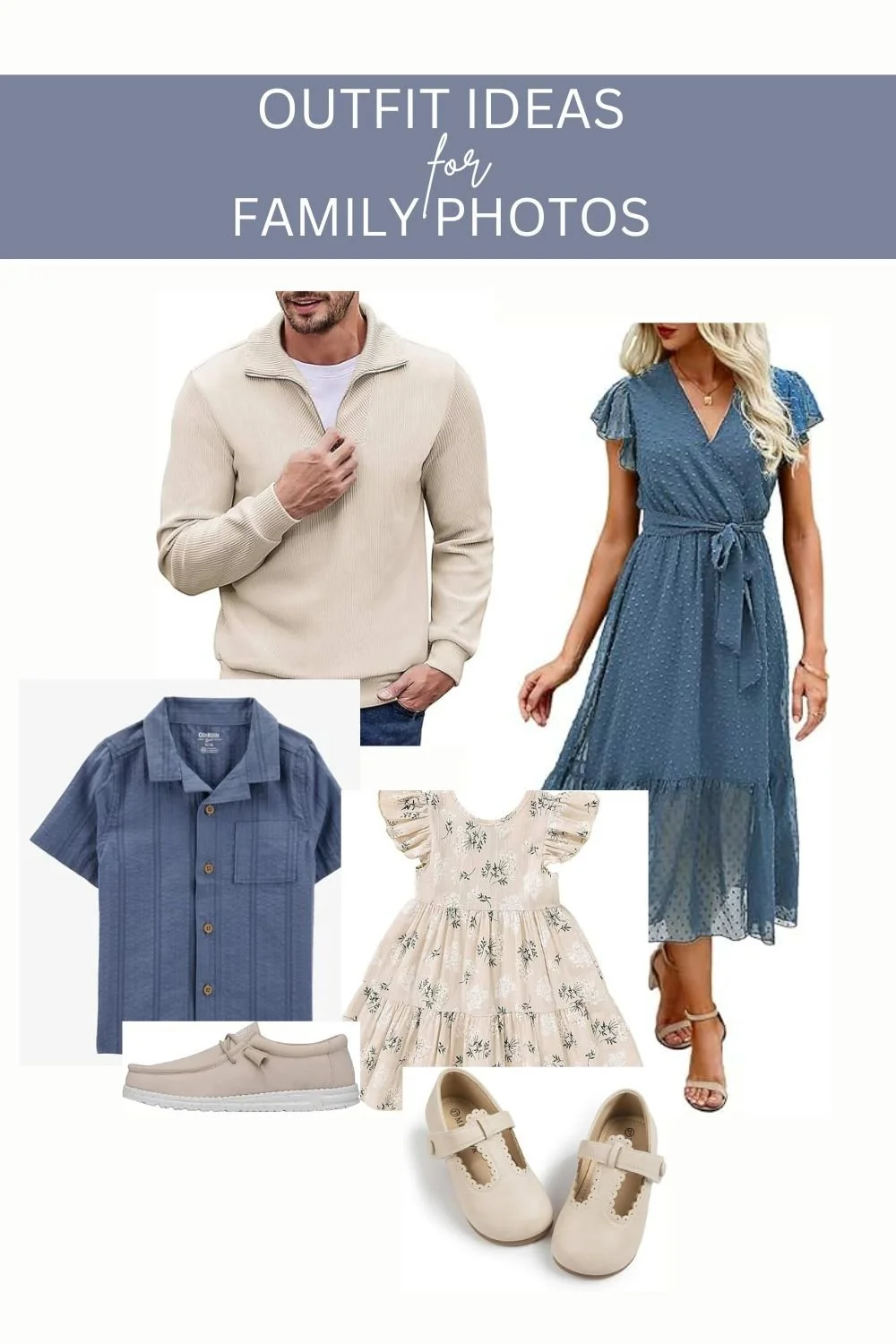
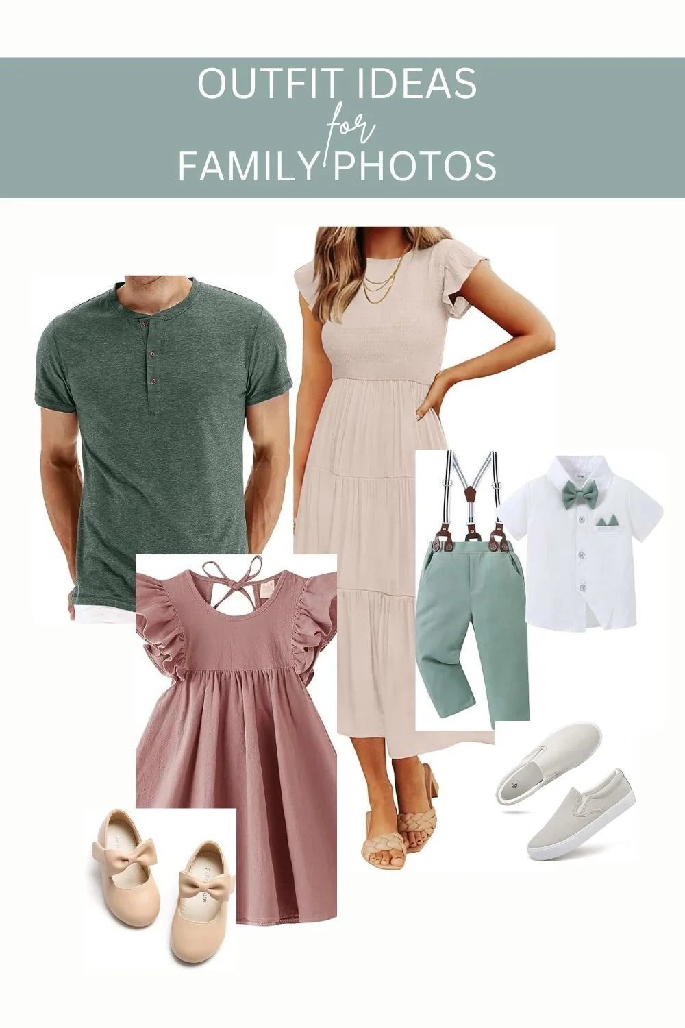
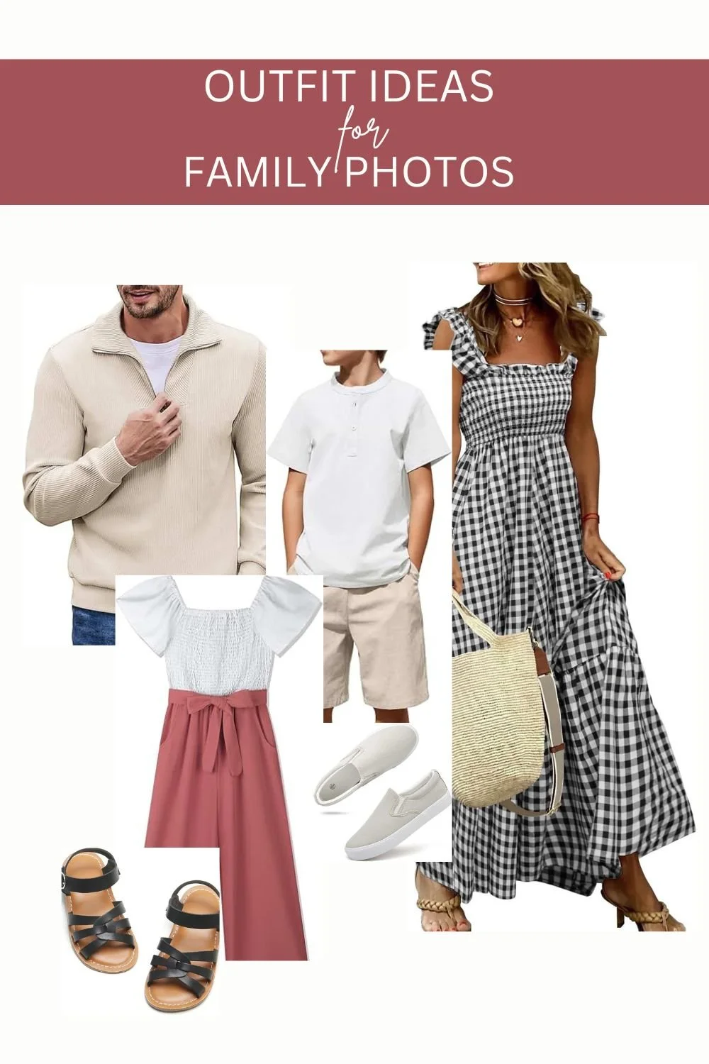
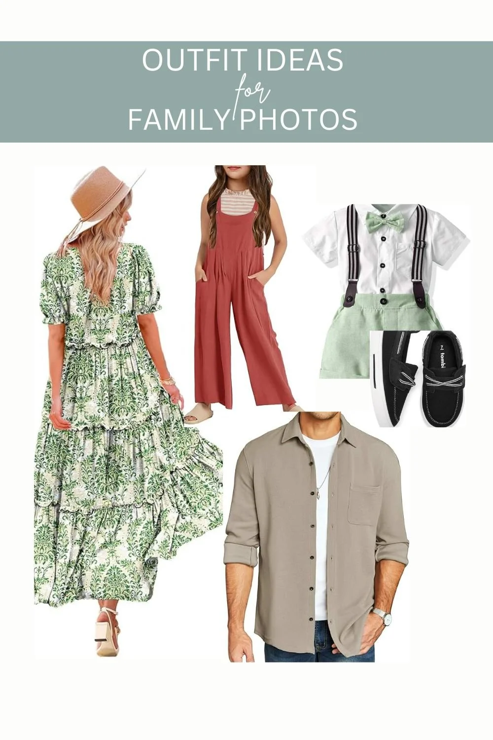
Please don’t wear identical white shirts and jeans! Instead aim for a coordinated color palette with complementary tones as seen in the photos below.
DO:
Choose 2-3 main colors and mix in neutrals (cream, gray, tan, navy)
Pick outfits that share a similar vibe, for example soft earthy tones or bright bold colors
Choose one outfit and use that as a starting point for everyone else. I usually choose my outfit first.
DON’T:
Exact matching outfits (it can look dated and unnatural)
Loud patterns and logos that distract from your faces.
Consider Your Location & Season
Your backdrop plays a big role in outfit choices!
Outdoor/Natural Settings? Earthy tones, soft blues, and muted greens blend beautifully.
Urban/Modern Backdrop? Bold colors or classic neutrals (black, white, gray) work well.
Fall Photos? Warm tones like mustard, burgundy, and olive green are perfect.
Spring/Summer? Light pastels or airy neutrals keep things fresh.
Dress for Comfort & Confidence
If you’re uncomfortable, it shows in photos!
Kids: Avoid itchy fabrics or stiff shoes—let them move freely!
Parents: Choose flattering fits you feel great in (flowy dresses, well-fitted layers).
Shoes Matter! Make sure footwear fits the location (boots for fields, barefoot or sandals for beaches).
Add Texture & Layers
Textures (knits, lace, denim) add depth to photos, and layers (jackets, scarves, cardigans) create visual interest.
💡 Pro Tip: A cozy blanket or hat can add a sweet, candid touch!
Avoid These Common Mistakes
Too Many Patterns: One or two subtle patterns are fine, but avoid clashing prints.
Neon or Ultra-Bright Colors: They can cast unflattering color reflections on skin.
Overly Trendy Outfits: Stick with timeless styles so your photos age well.
Final Checklist Before Your Session
✔ Do the outfits look good together when laid out?
✔ Are they comfortable for moving, sitting, and playing?
✔ Did you avoid distracting logos or neon colors?
✔ Are shoes and accessories cohesive?
Bonus: Need Color Palette Ideas?
Here are a few foolproof combinations:
Elegant Neutrals: Cream, taupe, soft gray, blush
Earthy & Warm: Olive green, rust, mustard, cream
Cool & Airy: Light blue, white, soft pink, denim
Bold & Moody: Navy, burgundy, emerald green, charcoal
Remember, the most important thing is that your family feels like themselves—because genuine smiles and connection make the best photos!
Need more personalized advice? Feel free to reach out—I’m happy to help!
See More Posts Like This One: